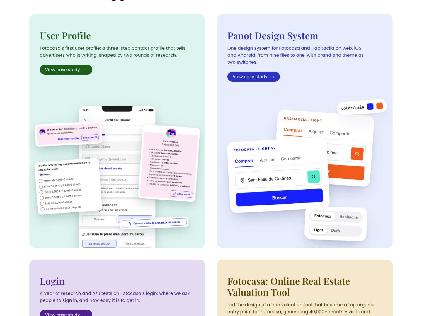
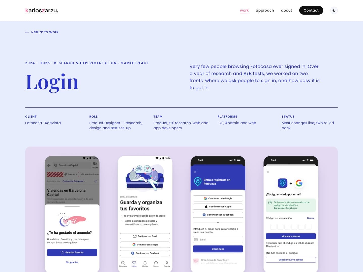
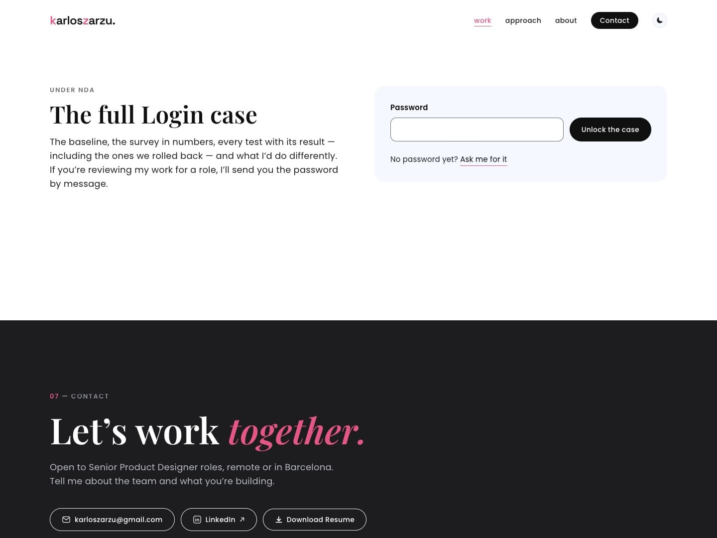
Side project · Sep — Oct 2026 · Live
Buildingthisportfolio
AI made options cheap: eight brand directions in three days. My job was choosing. This is how I set up the system, and the five calls it couldn’t make for me.
01 — the system
I didn’t use AI as a generator. I set it up as a design team: twelve steps, each led by a specialised agent — product, research, brand, UX, UI, art direction, development, QA.
Two rules hold it together. Whoever makes a piece never reviews it, so every page and every brand direction gets a crit from an agent that didn’t build it. And assumptions are never presented as findings. I run the process, set the criteria, and make the calls.
The agents
- Draft the brief and benchmark five senior portfolios
- Generate brand directions — eight in three days
- Build pages and components from the design system
- Crit each other’s work against a 38-point checklist
- Audit accessibility and measure contrast
Me
- Set the criteria before anything gets generated
- Choose, and kill what doesn’t earn its place
- Overrule work that’s right on paper and wrong in feel
- Decide the exceptions, and write them down
02 — decisions
five calls the system couldn’t make
Generating was never the bottleneck. These are the five moments where the system needed a decision it couldn’t make.
Call 01
What to leave out
- The system proposed
- The full twelve steps, including user interviews, usability tests and post-launch metrics.
- I decided
- Cut research, user testing and measurement. Keep brand, crit and QA at full depth.
A personal site with no audience yet has no users to interview, and a test with a few friends would have produced confidence, not evidence. I spent that time where a portfolio is actually judged: the brand, the craft and the first minute.
- Step 1: ProblemProductDone
- Step 2: ContextResearchDone
- Step 3: UsersResearchSkipped
- Step 3b: BrandBrandDone
- Step 4: SolutionsUX strategy · UIDone
- Step 5: Internal critArt directionDone
- Step 6: User testResearchSkipped
- Step 7: ImplementationUIDone
- Step 7b: BuildDevelopmentIn progress
- Step 8: QAQualityDone
- Step 8b: LaunchDeliveryDone
- Step 9: Close the loopResearchSkipped
Call 02
“Nothing visual”
- The system proposed
- Direction G after a round of honesty and accessibility fixes: accurate, compliant, and mostly text, with the work shrunk to thumbnails.
- I decided
- Rebuild it image-first, and turn my note into a rule every direction had to pass.
“Nothing visual” is feedback; “half the width” is a criterion. The system can’t apply taste, but it can apply a number — so I gave it three.
50%
of the first screen’s width, at least, goes to product imagery.
≤40
words above the fold. The work talks first.
1
large image per case, with annotations on the image, not in a table.
Call 03
Start again, or build on one
- The system proposed
- Another round of directions, generated from scratch.
- I decided
- Build on one. I took direction H — screens first, one tint per case, an editorial serif — and marked the design details I wanted changed. Those notes became the second round.
After seven competent directions, an eighth from scratch wouldn’t have changed anything — none of them felt like mine. Concrete changes to the one that came closest gave the system a brief it could act on, and made the result mine: the voice, the manifesto, the motion and the content.
02 — decisions
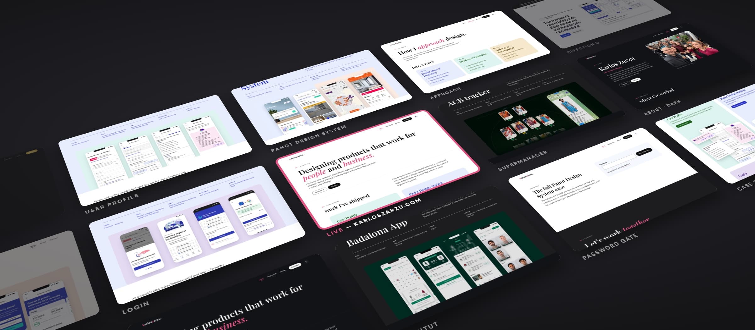
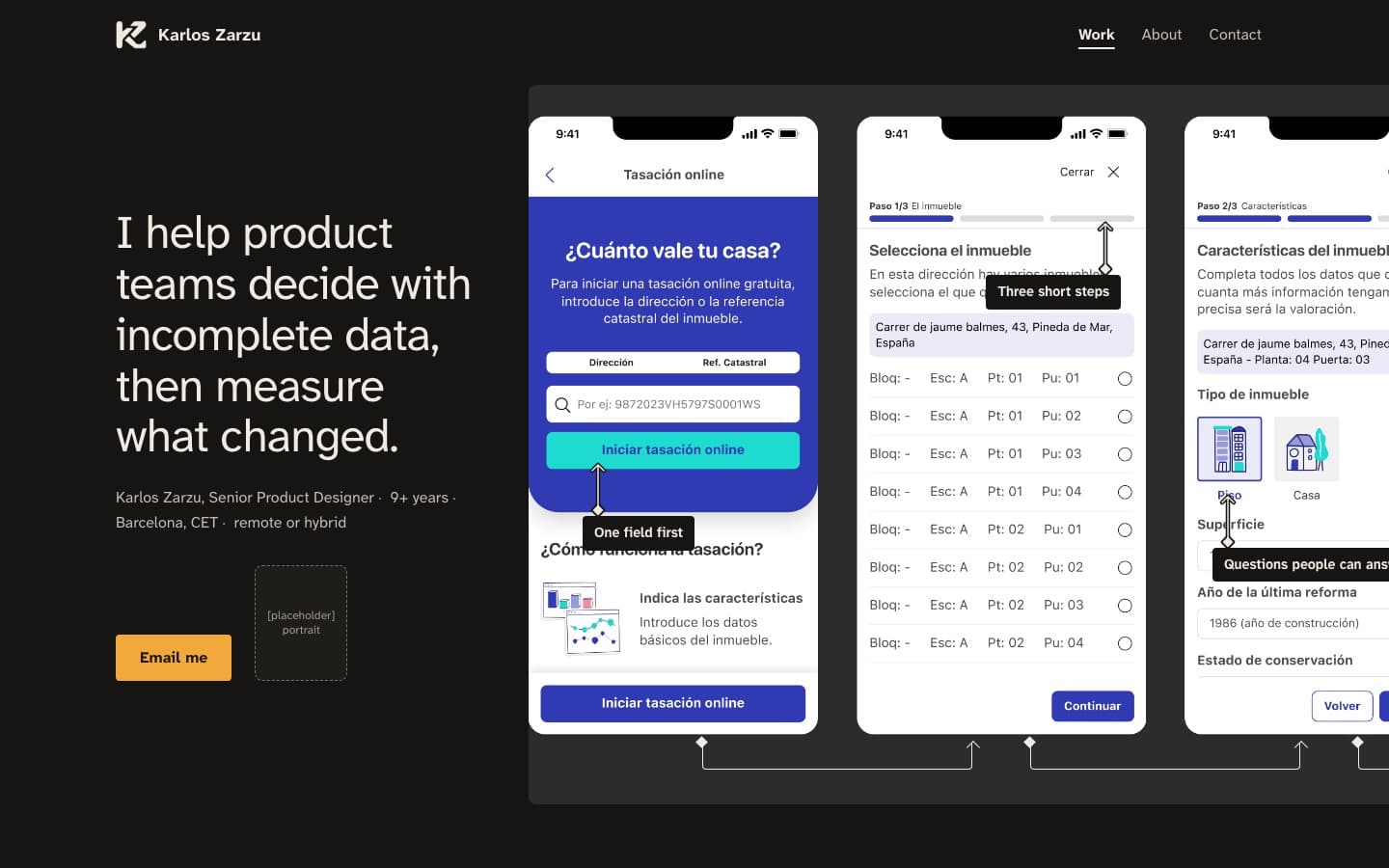
Round one: eight directions. These are the last five.
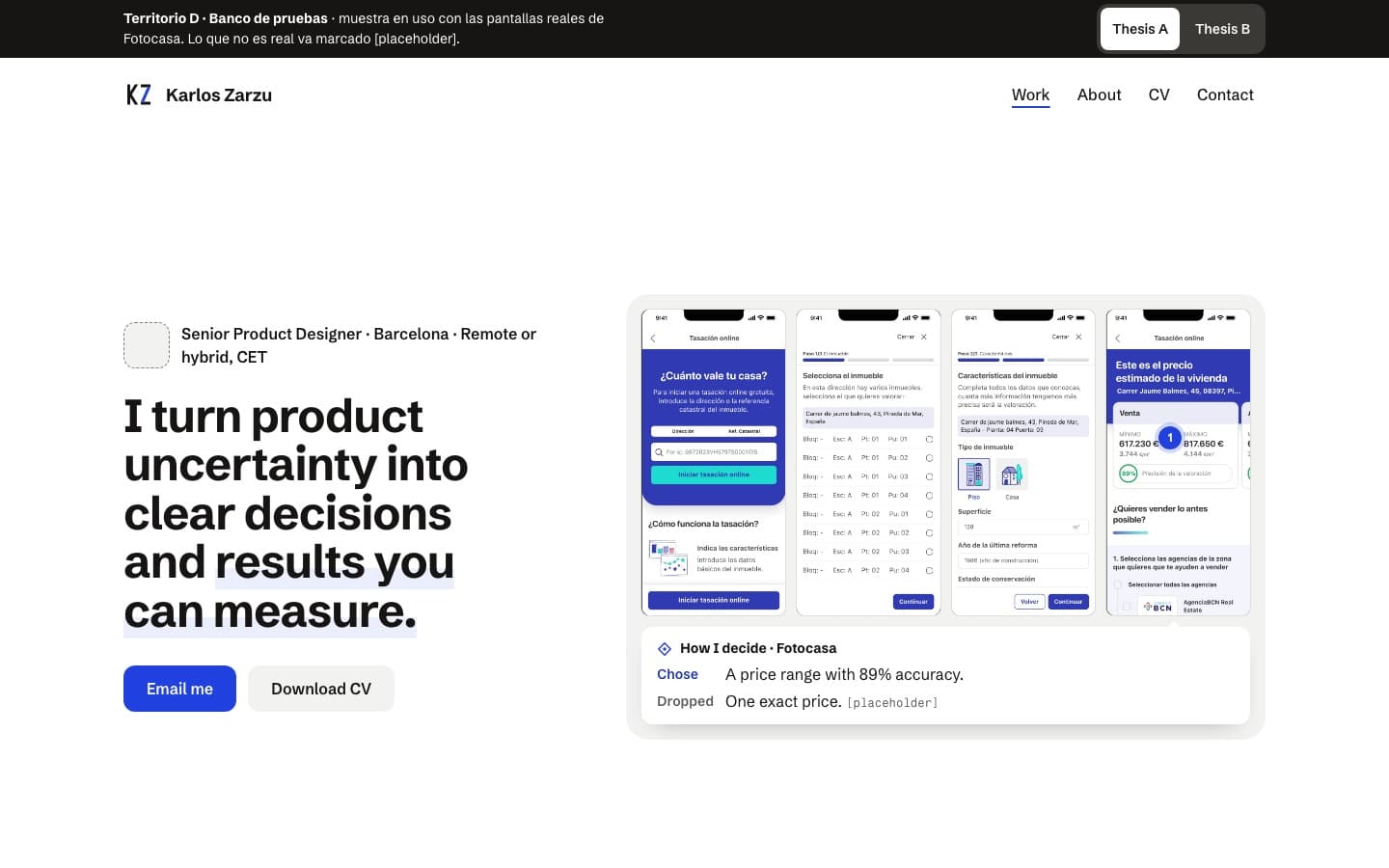
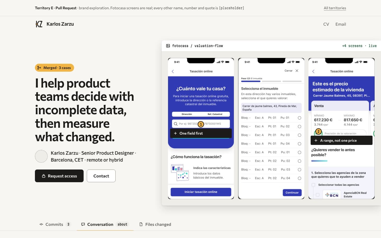
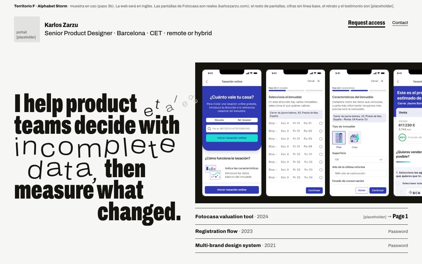
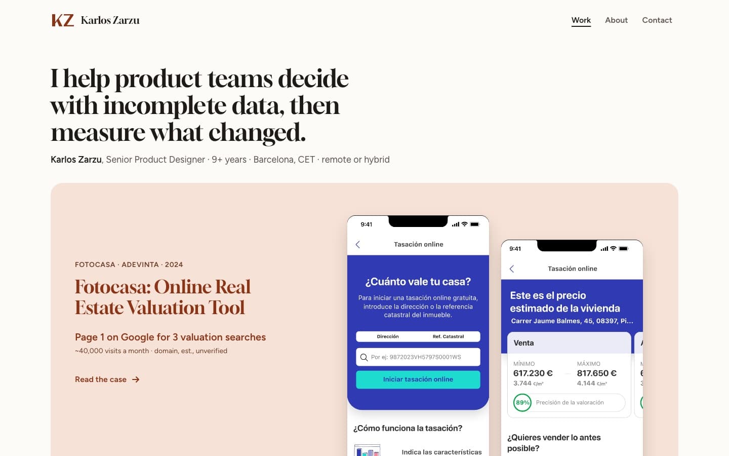
02 — decisions
Round two: four bridges.
My notes on H — what to change, what to keep — set up one more round before committing: four bridges, each starting from a first-round territory and moving toward that line. The question for each was the same — what survives?
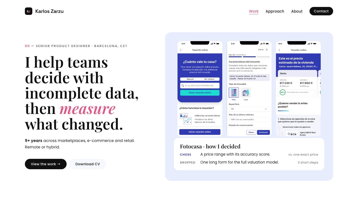
V2·A Workbench, editorial
From D- Survived
- The black primary button and the serif headline over a tinted product panel.
- Dropped
- The thesis as a headline, too abstract for a first screen, and the decision box, which belongs inside a case, not on the home page.
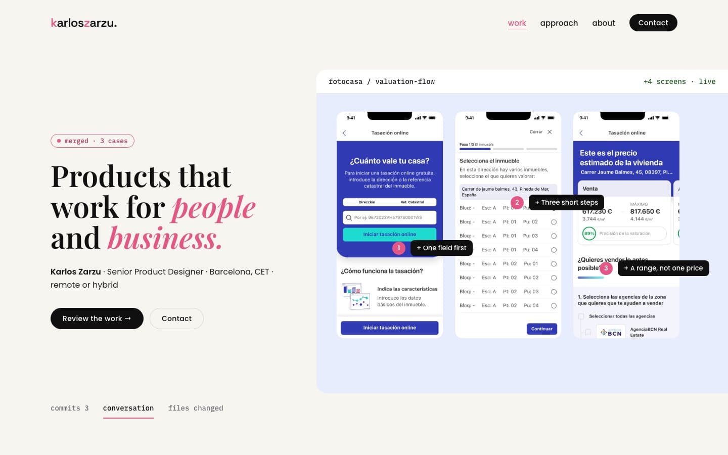
V2·B Pull Request, softened
From E- Survived
- Pink as the only annotation colour.
- Dropped
- The code-review chrome. Clever for designers, noise for a recruiter with a minute.
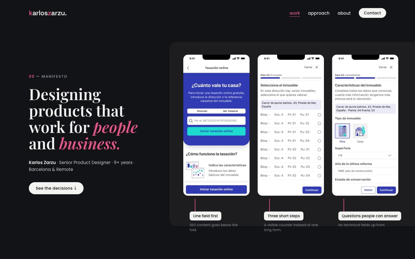
V2·C Annotated flow, lit
From G- Survived
- The manifesto as the opening line, and dark as a theme you can switch to.
- Dropped
- Dark as the default ground.
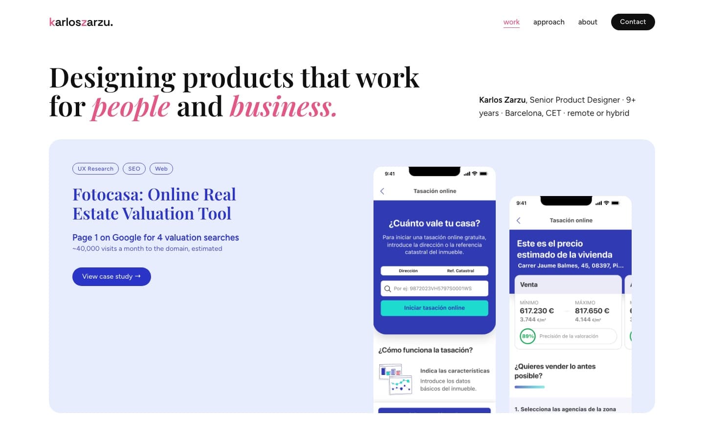
V2·D Tinted catalogue, refined
From H- Survived
- One tint per case, real screens bleeding off the card, and the result written on the card.
- Dropped
- A second sans for the interface. Poppins does the job alone.
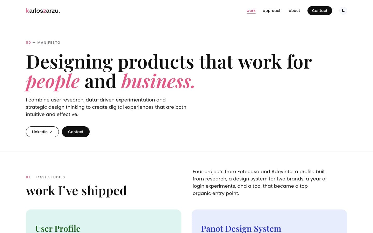
Call 04
Fix the tokens, keep one exception
- The system proposed
- Darken the pink wherever it carried small text, and darken the grey.
- I decided
- Black buttons instead of a duller pink, a darker grey, links matched to the email above them — and pink kept on short supporting text, as a written exception.
A muddier pink would have fixed the ratio and weakened the brand everywhere. Black solved the contrast and left pink for the single gesture per element the system is built on. Where colour alone carried meaning, on the active nav link, I added an underline. One fix overshot: the restyled LinkedIn link outweighed the email above it, so I matched the two.
Eyebrows and captions
2.80:1before · fails AA5.07:1after · passesSolid buttons
3.52:1before · fails AA19.03:1after · passesText links
3.52:1before · fails AA19.03:1after · passes
Call 05
Ship it, then add by pull request
- The system proposed
- Wait until every case had real content, real numbers and real images.
- I decided
- Launch on my own domain with what was finished, hide — not delete — everything half-done, and add the rest one pull request at a time, each with a preview I approve before it merges.
A portfolio that isn’t live doesn’t get read. Hiding the unfinished parts kept the bar high on day one, and the pull-request flow means nothing reaches the site without a preview and my OK — the same rule as the crits: whoever makes it doesn’t sign it off.
03 — build
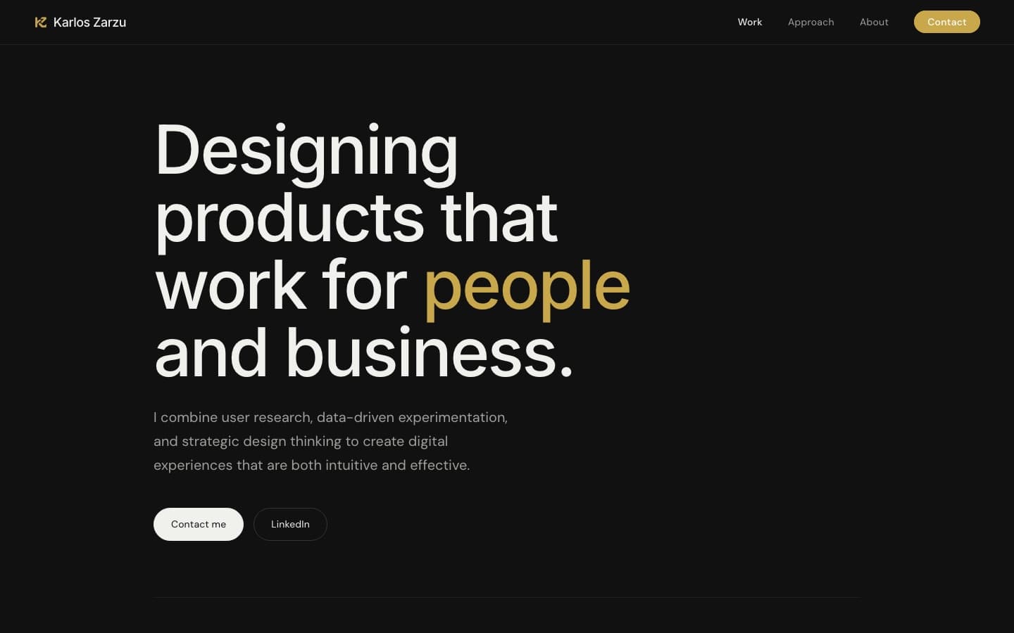
I built it in Next.js with real routes instead of the prototype’s hash links, so every page can be shared and indexed, and so the password gate for NDA work can live on the server rather than in the page. The motion came across intact: the scroll-driven manifesto, the collapsing nav, the pink curtain between pages.
The gate works on the server: one shared password, nothing protected in the public HTML or in the code the browser downloads, and access that lasts a minute — leave a case and come back, and it asks again. Protected images are only served for the case you just unlocked.
Two QA passes — 35 findings, then 21 — came from an agent that hadn’t built the pages. The fixes are the unglamorous part of craft: an animation that went blank with reduced motion now shows every scene, full cases dropped from 2–4 MB to under 1 MB, and the Back button no longer reopens a case once its minute is up.
It went live on karloszarzu.com on 9 October. Since then every change arrives as a pull request with a preview, and merges only after I’ve looked at it.
The home page — before / after
04 — learnings
what I’d tell another designer
Set the criteria before you generate
With AI, options are cheap and criteria are the bottleneck. I wrote the “visual leads” rule after seven directions, and three had to be reworked to meet it.
Separate making from reviewing
No agent reviewed its own work. The crits caught what the makers couldn’t see — like a direction that met the brief point by point and still looked like any SaaS site.
Write the exceptions down
Every rule I broke on purpose is recorded with a reason. That’s what turns “I liked it” into a decision someone else can challenge.