Late 2024 – 2026 · 0→1 · Marketplace
UserProfile
Fotocasa had no user profile. We designed one from scratch: a short contact profile that tells advertisers who is writing — what they’re looking for, when they want to move and how they’ll pay.
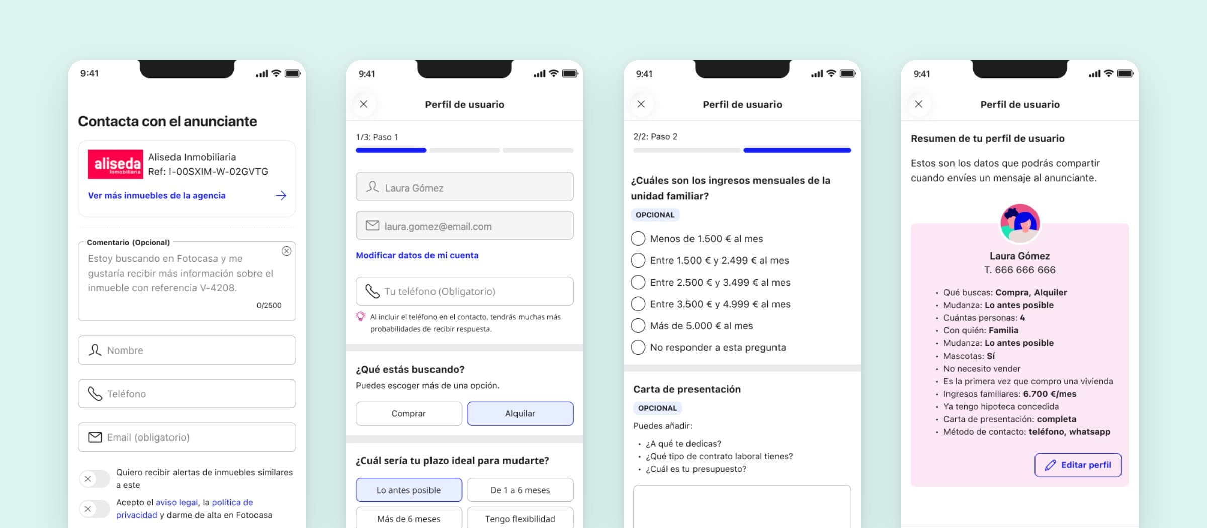
People told us they couldn’t find what they needed, and advertisers told us the leads they got were too few and too vague. A profile could help both: Fotocasa would know who it was talking to, and agencies would know who was writing.
I worked on it from the research to the final design: desk research with other designers, user interviews, two rounds of validation and the iterations in between. Designed for iOS, Android and web — the case shows the apps. The result is a three-step profile that travels with every contact — and a few questions that didn’t have an easy answer.
What travels with a contact
Before drawing a screen, we agreed on what an advertiser should know about the person writing. Renting and buying ask for different things.
Renting
- When they want to move in
- Who will live there, pets included
- Monthly household income, in ranges
- A cover letter
- How they want to be contacted
Buying
- When they want to move in
- Their situation as a buyer
- Whether they need a mortgage
- A cover letter
- How they want to be contacted
Every contact also carries the person’s name and phone, and their last three searches.
What research asked for
Sixteen interviews with renters and buyers became sixteen recommendations, grouped in five principles.
- Controlpeople decide what to share, and who gets to see it.
- Transparencyevery question says why it’s asked, and how long it takes.
- Flexibilityranges instead of exact figures, and more than one answer where it fits.
- Valuethe benefit of completing it is stated, not assumed.
- Inclusivityonly the questions that apply to each person’s situation.
Questions we weren’t sure about
Not everything had a clear answer. These four kept coming back.
- Income: an open field, or ranges?We planned to launch with an open field and test ranges later. We tested it, and ranges won.
- Phone: required, or optional?It’s one of the things people were least comfortable sharing, and the one that gets replies. It became required — with the reason right under the field.
- At the contact, or a profile of its own?Both: it’s offered as you write to an advertiser, and it lives in your account so you only fill it in once.
- A cover letter: written, or generated?Optional, with a hint of what to include and a button that drafts it with AI from your profile.
Under NDA
The full case
The research in numbers, every screen of the flow, how each question was resolved and what I’d do differently. Password protected — I share it by message.